
Why small RIP errors become expensive fast
Most sign shops do not lose time on one big failure. They lose it on small setup errors that repeat across a full day of vinyl, stickers, PVC banners and vehicle graphics. A file with the wrong media profile, a poor cutter offset, or a queue that was not checked after an update can waste metres of material before anyone notices. In a Randburg workshop, that can mean a whole morning lost while a courier waits and the client is phoning for status.
The biggest problem is that RIP software is often treated like a final button, not part of production planning. If the job is not prepared properly, the RIP will still process it, but the result may be too dark, too heavy on ink, or badly nested. That means extra trimming, extra ink cost, and in some cases a complete reprint. Busy teams need a routine that catches mistakes before the printer starts moving.
The most common setup mistake is using the wrong media profile
Incorrect media settings are the first thing to check when colours look off or ink dries too slowly. A profile that was built for coated vinyl will not behave the same way on uncoated banner material, and a profile for indoor poster stock will not suit an outdoor wrap. Some shops keep using the same file settings for everything, then wonder why a job curls at the edges or the blacks dry with a dull finish.
On humid days in Durban or along the Cape coast, this matters even more. The material absorbs and reacts differently, so drying times and pass counts need proper attention. If the RIP profile does not match the actual roll in the machine, the operator may end up with heavy ink laydown, blocked nozzles or a print that shifts in colour after lamination. That is not only a colour issue, it is a production issue.
- Check the media type before every new roll goes in
- Match resolution and pass count to the job purpose, not habit
- Keep a written setup sheet for the most used materials
- Revisit profiles after supplier changes or printer servicing
Queue clutter causes hidden delays and bad job priorities
A cluttered RIP queue can create more trouble than a wrong profile. When old jobs are still sitting in the queue, a rushed operator may send the wrong file, print the wrong quantity, or miss a nested layout that should have been combined. In some shops, there are also print, cut and contour-cut jobs all mixed together with no clear naming system. That is how a simple reprint ends up taking half an hour to locate.
Clear queue discipline matters in Johannesburg and Pretoria where teams often work with multiple rush orders at the same time. If the queue is not organised by machine, material and deadline, people start guessing. Good practice is to separate active work from archived work, name files in a consistent way and stop sending jobs straight from a designer’s folder without checking artwork size first. A few seconds of review can save metres of media and a lot of frustration.
- Use one naming format for client, size and finish
- Keep separate queues for print only and print plus cut
- Remove test files and duplicate versions daily
- Review the job list before the first print starts
Colour management fails when everyone relies on the monitor
Many shops still match artwork to what looks right on a screen, then blame the printer when the output is too dark or too flat. Monitors vary, lighting varies and room conditions vary. A colour that looks bright under shop lights can look flat once it is on vinyl. If the RIP is not set up with a proper workflow, your reds may lean orange and your greys may pick up a colour cast.
This becomes a serious problem for repeat work. A franchise sign, a school banner or a fleet panel should not change tone each time it is reprinted. Colour management is not only for large studios, it helps any print room keep consistency across jobs. In a Midrand or Centurion visit, we often find that one operator uses default settings while another adjusts by eye. That is when quality starts drifting job by job.
- Calibrate proofing monitors on a set schedule
- Use the same lighting when checking final output
- Save profiles for each machine and each substrate
- Keep a sample strip for repeat colours and brand work
Cutter setup mistakes waste vinyl faster than most people expect
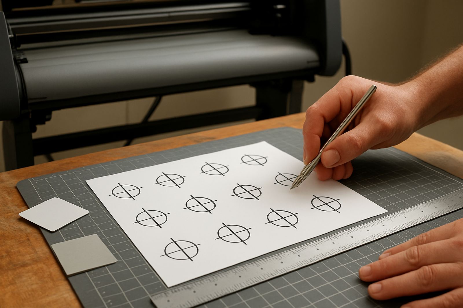
Vinyl cutters are often treated as simple machines, but small setup faults can waste a surprising amount of material. If blade offset is wrong, the cutter may drag corners, overcut text or lift delicate parts during weeding. If pinch rollers are not aligned, the vinyl can skew and ruin an entire run. That means extra trimming, poor finish quality and in some cases a job that cannot be saved.
We see this often when a new operator starts without proper induction. They may know design software but not the machine behaviour. A clean cut depends on the right pressure, the right speed and a tested offset for that specific blade holder. In a busy shop, cutter setup should be checked before long runs, not after the first roll has already been spoiled.
- Test blade offset on a small sample before a full run
- Check pinch roller position every time the roll changes
- Use weed lines on intricate graphics
- Keep cutter settings logged for each common media type
Skipping training creates repeat mistakes in the same shop
The same errors appear again and again when staff are taught by trial and error. One person learns a shortcut, the next person copies it, and soon nobody remembers the correct setup. That is costly in a production room because each shift becomes a new guess. Training is not just for new staff, it helps experienced teams update their methods when software changes or new machines are added.
A Gqeberha shop that handles indoor displays, car decals and event signage may need three different ways of preparing jobs. If the team uses one habit for all three, quality slips. Structured training helps people understand why a setting matters, not just where to click. That makes the workflow more stable when the studio is busy or when the power comes back after load shedding and jobs need to resume quickly.
A simple pre-flight check saves ink, vinyl and time
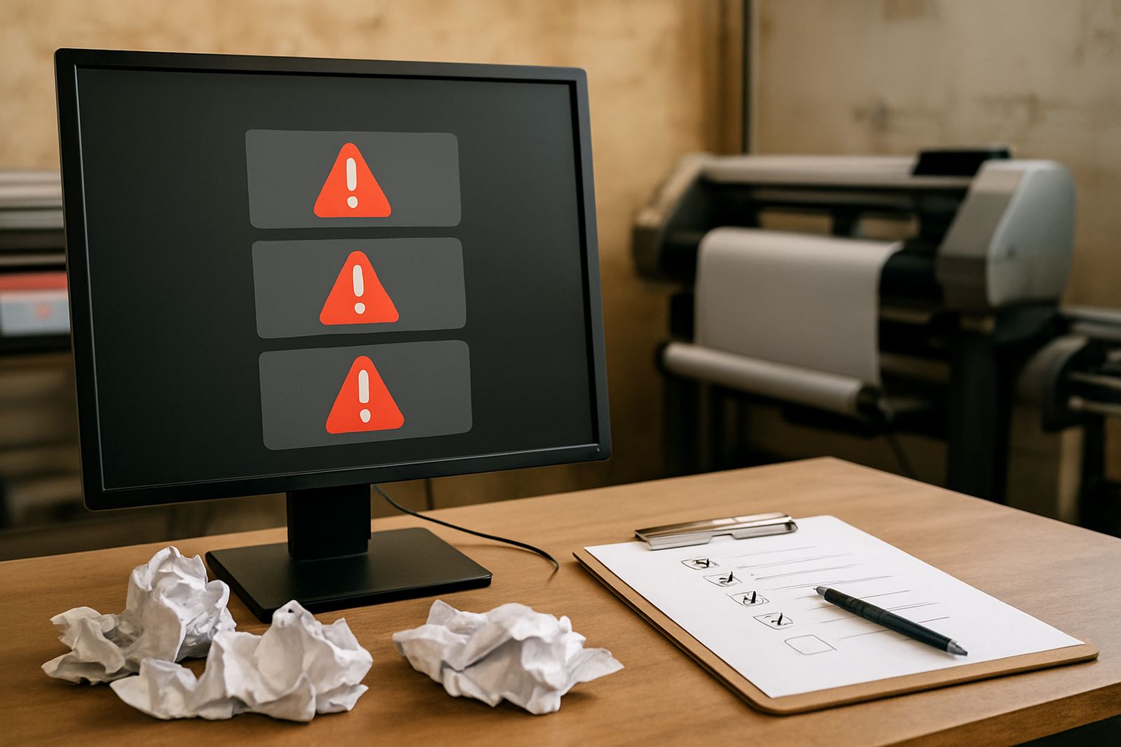
The best way to reduce RIP mistakes is to build a short check before every major job. This does not need to slow production. It just means confirming the basics before the machine starts. A five minute review can prevent a five metre loss. For shops that print daily, the check should become part of the handover between design, RIP setup and production.
Here is a practical order that works well in South African print rooms:
- Confirm artwork size and bleed
- Check the correct media profile
- Review colour settings and density
- Make sure the queue is clean and the right machine is selected
- Test cutter alignment or print and cut registration where needed
- Confirm the final quantity before release
When this routine is followed, the RIP stops being a source of surprise and becomes a proper production tool. That is the difference between chasing problems and running jobs with control.