
Why Cape Town light can mislead the eye
Colour matching starts with what people see, and Cape Town light can be tricky. A proof viewed under bright morning sun in Woodstock will not read the same way under soft afternoon cloud, and the reflection off white walls or a glossy floor can make a neutral grey look warm or cold. If a client is signing off artwork near the window, the room itself is already shaping the judgement.
For shops handling vehicle graphics, shopfront vinyl, labels and display work, that matters because the customer is often comparing a screen, a paper proof and a finished substrate in different places. The goal is not to chase a perfect visual match in every room, but to control the viewing conditions so the decision is based on the file and not the weather.
In Cape Town, the harbour air, coastal mist and sharp daylight can all affect how we read density, contrast and saturation. A design that looks slightly dull in the studio may still print correctly once it is viewed in a controlled booth or under consistent colour-correct lighting.
Humidity near the coast changes media behaviour
Moisture is one of the biggest local factors. In areas closer to the sea, paper, coated media and some self-adhesive films can absorb moisture overnight, then release it during the day. That changes curl, feed accuracy and ink laydown. If a roll stored in a cool back room is taken straight onto the machine without acclimatising, the first metres can behave differently from the rest of the job.
That is why print shops in Cape Town need a simple storage routine. Keep media sealed where possible, let rolls settle in the production space before loading, and avoid placing consumables beside open doors or direct sunlight. Even small changes in temperature can alter drying time and the way a colour block settles on the surface.
- Store rolls off the floor and away from damp concrete.
- Allow cold stock to acclimatise before printing.
- Check edge curl before loading narrow jobs.
- Keep proof paper in the same room as the printer.
These steps sound basic, but they prevent a lot of wasted material. A shop in Milnerton or Paarden Eiland may see more movement in stock than a team further inland and that extra movement can show up as banding, feed drift or a slight shift in tone.
Proof rooms need steady light, not just good intentions
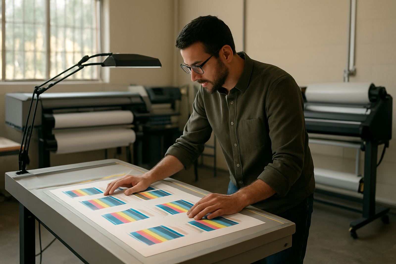
A proper proof viewing area does not need to be fancy. It does need to be consistent. Use one fixed light source, keep the walls neutral and avoid mixing daylight with warm indoor bulbs. If the proof is moved from a shaded room to a sunlit counter, the client may approve a colour that changes once the job is installed outside on a west-facing wall.
For print service providers working with brand colours, the best habit is to inspect proofs at the same time of day, in the same room, with the same lighting. If your team works from Randburg and supports clients in Cape Town, this matters even more because remote approval often happens without everyone standing in the same space.
We often advise shops to keep a simple proof log. Record the media, the RIP queue, the printer setting, the room conditions and the viewing light used at approval. That record helps when a client later says the red looks different from last month’s run. In many cases, the problem is not the file, but the conditions around the file.
RIP settings are only useful when the whole workflow is stable
Colour management is not only about profiles. It is also about feeding the RIP the same information every time. When a shop changes the print mode, the media profile or the queue order without tracking it, consistency slips. That is why workflow setup and RIP queue optimising are part of the same job.
A good system should cover:
- the exact media name and print mode used for each product
- the preferred black generation or ink limit for that substrate
- the drying or curing time before finishing
- the order jobs are sent to the printer
- the colour check routine at the start of each shift
In a busy Cape Town shop, a late job for a retail client may be queued after a vehicle wrap panel and before a batch of stickers. If the team skips its standard check, the print conditions can shift from one job to the next. A steady RIP setup reduces that risk and saves time when the same client returns for a repeat order.
Local example: a Sea Point retail run after a wet front
Take a shop preparing window graphics for a retail space in Sea Point after a rainy coastal front. The proof was approved two days earlier in clear weather, but by installation day the room is cooler, the air is damp and the print roll has been sitting in a storeroom with the roller door opening and closing all morning. The first panels are slightly longer on feed and the contrast appears softer than expected.
The fix is usually not a full reprint. It is a workflow reset. The media is left to acclimatise, the printer is checked for feed consistency, the proof is reviewed under the same lighting used for approval, and the final output is compared against the saved job settings. In most cases, the issue becomes manageable once the shop stops treating the environment as if it were neutral.
That is the practical part of colour control in Cape Town. The city’s weather does not make print work impossible, it just makes the shop pay attention to more variables than an inland team might face on a dry day in Pretoria or Randburg.
When to call for support, training or a fresh colour plan
If your team keeps seeing the same type of mismatch, it may be time for a proper review. Our Cape Town support work covers licence activation, software installation, remote support, onsite training and colour workflow setup for sign shops, vinyl cutters and print service providers. We also help with cutter setup, new staff induction and annual support planning when a business needs a better routine before peak season.
A good review usually starts with three questions. Are the proof conditions controlled, is the media stored correctly, and is the RIP queue using the same settings every time? If the answer is no to any of those, the print shop is likely losing hours and material without realising it.
For Cape Town teams dealing with humidity, changing light and municipal space constraints, colour consistency is less about chasing perfection and more about building repeatable habits. Once the studio, the software and the viewing conditions are all aligned, proof approval becomes faster and client calls about colour differences become far less frequent.