Why a plain quote often slows sign approval
A written price on its own can leave too much to the imagination. A customer may agree to a gate sign, shopfront panel or vehicle graphic in principle, then change direction once they realise the final piece will sit differently in daylight, on a wall with uneven paint, or against a busy street front. That back-and-forth costs time for the client, and the print team.
When a quote includes a simple visual, the conversation becomes more practical. The customer can see the size relationship, the wording order, the logo placement and the colour contrast before anyone cuts material or sends a job to print. In South Africa, where many clients are comparing options during load-shedding schedules, quick visual approval also helps keep work moving when the power is off and the workshop is catching up after hours.
- Use the visual to show size, position and layout, not just decoration.
- Keep text legible at the size the client will actually see on site.
- Show the quote image next to the written specification so nothing is missed.
What to show in a quote visual so the client makes a faster decision
A useful quote visual does not need to be complex. It needs to answer the questions a client always asks: How big will it be? Where will it go? What will it look like from the road? Will it still read clearly in the rain, bright sun or evening traffic? For a sign shop in Randburg quoting a restaurant in Fourways, a simple mock-up on a wall photo can be enough to settle most of those points.
Include the key production details right on the proof. If the job uses cut vinyl, print-and-cut graphics, a display panel or a wrap component, say so clearly. If the client asked for a matte finish because the site has strong reflections from the glass frontage, show that in the note. The aim is to reduce guesswork and make the quote feel like a working plan rather than a rough idea.
- Site photo or clear background image
- Exact dimensions in millimetres or metres
- Material or finish notes
- Text content, logo position and any legal wording
- Installation notes if drilling, poles or municipal approval are involved
Using simple mock-ups for vinyl cutters, print shops and sign makers
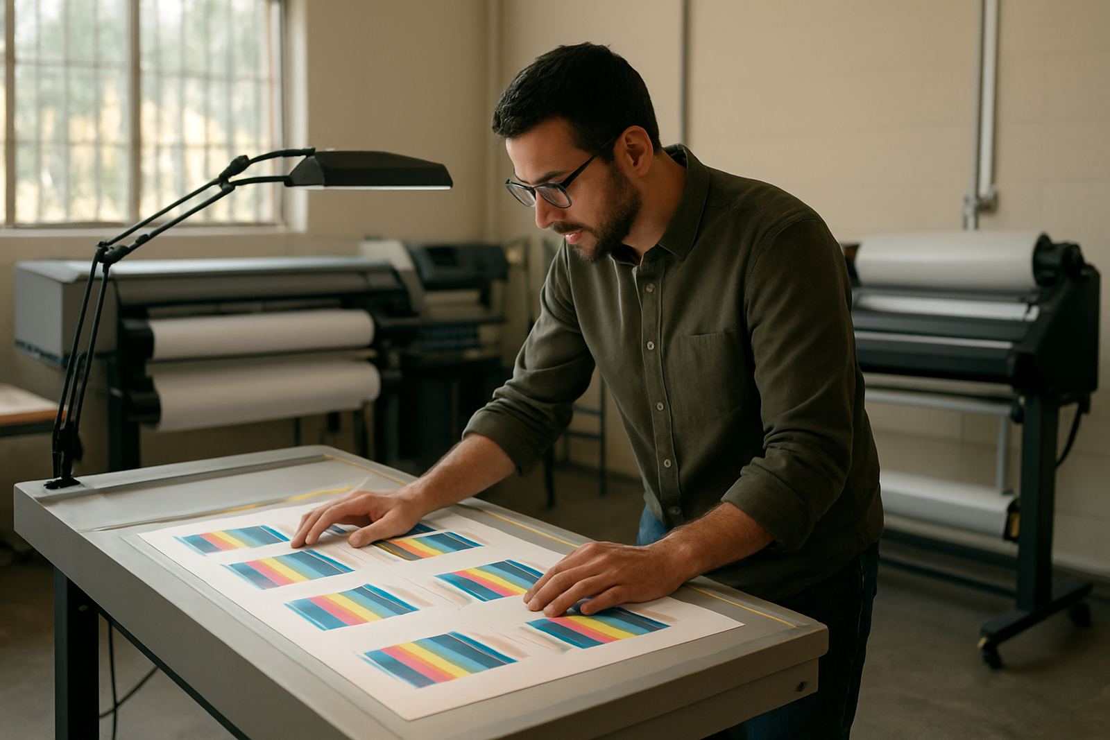
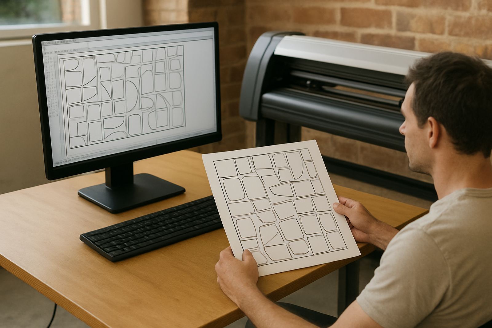
Different production methods need different visuals. A vinyl cutter operator needs to know whether the artwork will weed cleanly and whether small text will hold together at the chosen size. A print service provider needs to see where the trim lines sit and how the colour blocks will behave on the chosen stock. A sign maker doing an aluminium composite panel needs clear spacing for mounting points, returns and edge finishing.
That is where a proper quote visual saves time. Instead of explaining the job in a long message, you can show one clean image with notes. If the client needs a change, it is easy to update the proof before production starts. For teams handling several jobs a day, this also helps new staff understand the order of operations. It is quicker to approve a sign that is already visible, than to interpret a paragraph of instructions and hope nothing was missed.
- Show cut lines, bleed and safe areas for print jobs.
- Mark weeding limits for small vinyl lettering.
- Include mounting holes, brackets or stand-off details where needed.
- Use one approved visual as the reference for the full job ticket.
A local example from Randburg to Gqeberha
A clothing store in Randburg may want a front window graphic, a hanging panel and a small directional sign for the parking entrance. If the quote only lists the prices, the owner might ask three separate times where each item will go. A quick mock-up placed on a photo of the actual frontage answers that in one go. The same approach works for a franchise site in Pretoria or a coastal retail unit in Gqeberha, where salt air can affect material choice and fixings.
For coastal work, the visual can also support practical conversations about durability. If the installer recommends stainless fixings, sealed edges or a different substrate because of humidity and corrosion, the client sees that the advice is part of the job plan, not an extra upsell. That makes approval easier and often shortens the gap between quote and installation day.
We often find that once a client sees the sign in context, they stop asking for broad changes and start asking precise questions, which is exactly what you want before production begins.
How workflow setup improves the look of quote visuals
The quality of a visual quote is often linked to the workflow behind it. If file naming is messy, artwork versions get mixed up and the wrong proof can be sent out. If colour settings are not controlled, a red logo might look dull on screen and too bright in print. Good workflow setup keeps the quote process orderly, so the first visual sent to the client is usually close to the final approved version.
For South African sign shops, that means paying attention to colour management, RIP queue settings and cutter setup before the pressure starts. Once the system is organised, staff can produce cleaner previews, avoid repeat exports and keep approval notes in one place. It also helps when the business is busy across Johannesburg, Midrand or Durban and different team members are handling jobs at the same time.
- Use consistent templates for common quote types.
- Store approved logos and artwork in a shared folder with clear naming.
- Check monitor calibration and print profiles regularly.
- Keep one version of the proof as the production reference.
A practical checklist before you send the quote
Before a quote goes out, take a minute to ask whether the visual answers the real buying question. Does the client understand the size? Can they see the exact wording? Is the colour close enough to approve? Is the finish clear? If any of those points are vague, the quote will probably come back with more questions. That does not mean the design must be fancy. It just needs to be honest, neat and specific.
For many teams, a short checklist saves more time than another round of explanation. It also gives new staff a clear standard to follow, whether they are working from Randburg, doing a remote update for Cape Town, or preparing for onsite training in Centurion. The same discipline that makes a quote look professional also helps the whole job run better after approval. And in a trade where margins can be tight, fewer surprises usually means better profit.
- Confirm artwork spelling and contact names
- Check dimensions against the site measure
- Show the visual on the actual background photo where possible
- Note any installation risks, access limits or weather concerns
- Include the approval step so the client knows what happens next