
What spot colour means in day to day print work
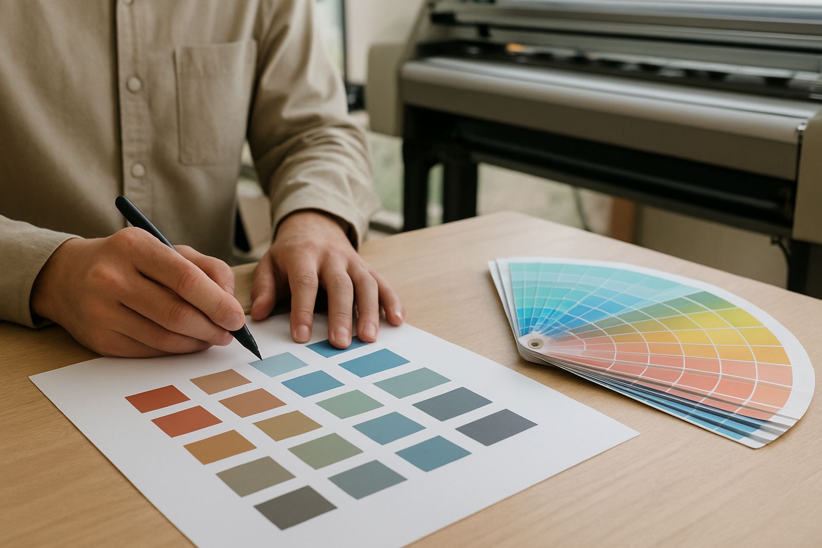
A spot colour is a single, named ink or colour build that is handled separately from the usual four colour process mix. In plain terms, it is the colour you choose when a client says the logo must look the same on every banner, self-adhesive job or board, no matter who prints it or which machine is used.
For sign shops and print providers around Randburg, Johannesburg and Pretoria, this matters more than people think. A brand colour on shopfront vinyl can be judged next to an older sign in the same street, so a small shift is easy to spot. Spot colours are also useful when you need cleaner solid areas, fewer banding issues and less guessing during a reprint.
The key idea is simple: process printing builds colour from dots, while spot colour is managed as its own target. That makes it easier to repeat, provided the workflow is controlled from file prep through to output.
Why repeatability matters more than a perfect screen view
A screen can be useful, but it does not carry the same weight as a printed sample. A client in Durban may approve a logo on one machine, then ask for a reprint three months later on another printer after a paper change and a humidity change. If the colour workflow is not managed properly, the second run can drift enough to cause a dispute.
This is where spot colour habits help. Set the colour correctly in the artwork, keep the file naming clean and maintain the same printer profile, media setting and cutter setup where needed. On a busy production floor, consistency beats guesswork every time.
- Use the same colour standard across repeat jobs.
- Keep a simple record of media, ink set and finishing details.
- Check approval proofs before the job enters full production.
- Revisit older jobs when a client asks for a match, not just the latest file.
In coastal areas like Cape Town and Gqeberha, humidity can affect drying and media behaviour, so repeatability is not only about colour, it is also about how the print settles after output.
How spot colours move through a RIP workflow
A RIP program is where colour intent becomes production reality. It translates the artwork into instructions the printer can follow, which is why spot colour handling inside the RIP matters so much. If the spot colour is mapped correctly, the software can output a cleaner match, or at least a predictable conversion, instead of leaving the job to chance.
Before printing, check whether the file uses named colours properly. Some clients send artwork with a colour name that looks right but is not defined well in the file. Others paste logos from different sources and the same brand appears in three slightly different shades. That is where a solid setup and a trained eye save time.
- Confirm the spot colour name in the artwork before sending the job to print.
- Map the named colour to the correct print target in the RIP.
- Test with a short sample before running large quantities.
- Save the approved setup for future reprints.
For businesses in Randburg and Midrand that handle vinyl cutters as well as printers, the same discipline helps with contour cutting. A poor colour setup can lead to wasted material and extra setup time on the cutter too.
Proofing a colour with real world conditions in mind
A proper proof is not just a pretty sample. It is a working reference that must survive handling, lighting and installation. A sign that looks fine under indoor tube lighting may look different outside a retail centre in Centurion at midday. That is why practical proofing matters more than a quick glance on a screen.
When proofing spot colours, use the same or similar substrate where possible. A gloss vinyl proof will not behave like a matte board or a textured material. Even the backing colour can change the eye reading, which is why short production samples are often better than large assumptions.
Keep the proof process simple and honest. If the client needs exactness, show the sample in a realistic setting and note the material, finish and viewing conditions. That saves arguments later and helps the installer know what was agreed.
Common mistakes that cause colour disputes
Most colour disputes do not start with the printer, they start earlier in the workflow. A file may arrive with RGB images, mixed brand assets and no clear colour reference. If the team prints it without checking, the final result can be close but not close enough.
Another common issue is ignoring the impact of maintenance. Dust on the print head, a worn roller, or an uncalibrated cutter can all add small errors. In winter, load-shedding can interrupt production and force a restart, so saved settings and clean job notes are useful.
- Do not rely on a client saying the colour is just blue.
- Do not swap media settings without rechecking the output.
- Do not assume yesterday’s approval still matches today’s printer condition.
- Do not let cutter setup drift when the print and cut workflow is linked.
A little discipline goes a long way. The shop that logs settings, stores approved samples and trains staff properly will usually handle reprints with less stress and less waste.
A practical South African example for sign shops
Imagine a retail client in Johannesburg wanting new window graphics for several branches, with one central brand colour that must stay the same across every site. The artwork arrives from head office, then one branch asks for a slight change to match older signage. Without a clear spot colour process, the result can become a patchwork of almost-right shades.
With the right workflow, the team can assign the named colour, set a stable RIP profile, and produce a repeatable result across the different branch orders. The installation team then knows what to expect when fitting the graphics in Randburg, Pretoria or even Gqeberha, and the client gets one consistent brand colour instead of a different shade at each location.
That is the real value of spot colour basics. It is not only about colour theory, it is about keeping production predictable in a business where time, material cost and client trust all matter.